Articulate Design Guide
Content Organization
When designing instructional content I prioritize establishing a uniform, consistent, and logical sequence to the material.
Instructional Sequencing and Structure
Organize instructional events to support the achievement of defined learning objectives.
Sequence content based on established instructional design principles (e.g., Gagné’s Nine Events, Bloom’s Taxonomy).
Align instructional flow with learners’ prior knowledge and the desired performance outcomes.
Ensure each segment builds on the last, promoting a cohesive and progressive learning experience.
Principle in Practice:

Typography & Text Design
The typography I use in instructional content directly reflects the client’s brand standards, including font selection, styles, and color schemes.
In addition to brand alignment, I carefully consider the following:
Prioritize visual clarity and readability to support effective learning across all devices and formats.
Use appropriate font sizes, line spacing, and alignment to enhance accessibility and comprehension for a diverse audience.
Select legible typefaces that perform well in both digital and print environments.
- Use expressive or “fancy” fonts sparingly, and avoid “cursive” style fonts.
Maintain sufficient contrast between text and background to meet accessibility standards.
Apply a consistent typographic hierarchy (e.g., headings, subheadings, body text) to guide learners through the content logically.
Principle in Practice:
Color Palette & Contrast
The color palettes I use in instructional content are guided by the client’s brand standards, ensuring consistency with their visual identity.
In addition to brand alignment, I prioritize the following:
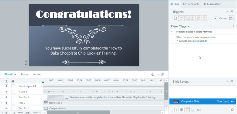
Use cohesive, visually balanced color schemes that enhance content clarity without overwhelming the learner.
Prioritize high contrast between foreground and background elements to support readability and draw attention to key information.
Adhere to WCAG 2.1 color contrast guidelines to ensure accessibility for learners with visual impairments, including color blindness.
Avoid using color as the sole means of conveying meaning (e.g., error messages or required fields), ensuring accessibility for all users.
Ensure consistent use of accent and highlight colors to emphasize instructional elements such as buttons, headings, and callouts.
Aim to minimize cognitive overload by limiting excessive or non-essential use of color, keeping the focus on the instructional content.
Evaluate color choices across multiple devices and lighting conditions to maintain visual consistency and legibility.
Graphic & Visual Design
Visual elements are selected based on the instructional content’s purpose and learning objectives. The following guidelines are used to ensure clarity, relevance, and professionalism:
Screenshots
Accurately represent system steps or processes to guide learners effectively.
Are clear, with legible text (no blurring or pixelation).
Any PHI or sensitive information is fully obscured using non-transparent, background-matching overlays to avoid distraction.
Where essential information is hidden, realistic placeholder data is inserted to maintain instructional value.
Images
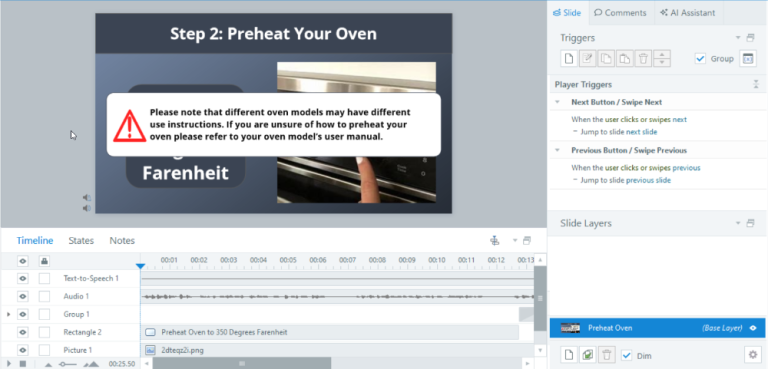
Are high-quality, directly relevant to the instructional content, and suitable for a professional audience.
Principle in Practice:

Developing in Storyline
Articulate development subject to company needs. However, general guidelines I follow include:
Visual Design
Begin with a dark, visually clean background theme to enhance contrast and readability.
Use font sizes of 14pt or larger for clarity and accessibility.
Limit text colors to black and white to maintain visual consistency and reduce cognitive load.
Audio Narration
Utilize third-party AI voiceover tools (e.g., WellSaid Labs) for clear, natural-sounding narration.
Maintain consistent tone and pacing to support learner engagement.
Accessibility
Generate closed captions within Articulate using the built-in Text-to-Speech feature to ensure content is accessible to all learners.
Accessibility Standards
Instructional materials are designed to be inclusive, flexible, and aligned with Web Content Accessibility Guidelines (WCAG) to support diverse learner needs. Key practices include:
Closed Captions
Support learners who are deaf or hard of hearing.
Enhance engagement and content retention for all users.
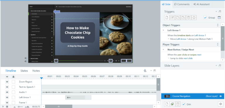
Navigation Guide
- Supports first-time eLearning users.
- Sets Learner expectations.
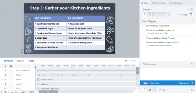
High Color Contrast
Improves readability for learners with visual impairments.
Reduces eye strain across varying screen conditions.
Simple Interface Design
Supports users with mobility, cognitive, or memory challenges.
Benefits learners unfamiliar with virtual instruction environments.
Limited On-Screen Text
Reduces cognitive load and visual fatigue.
Accommodates learners with reading or learning disabilities while promoting concise communication.
Color-Blindness Considerations
Avoid use of problematic color combinations (e.g., red on green).
Ensure that color is never the sole method of conveying meaning.
Principle in Practice:
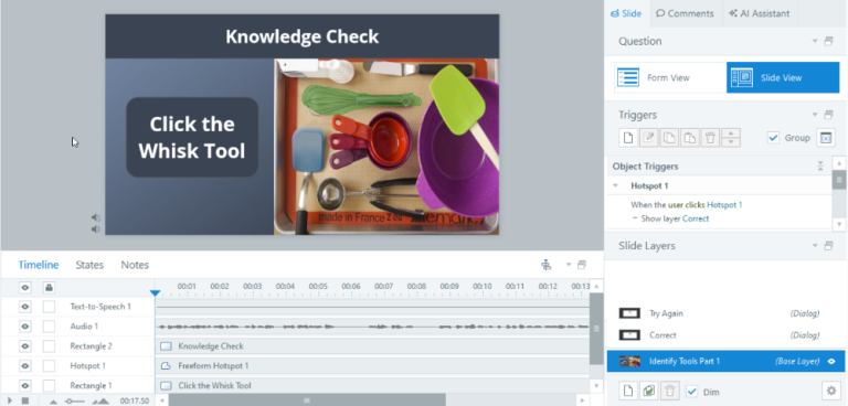
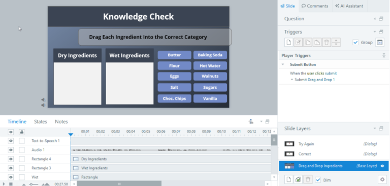
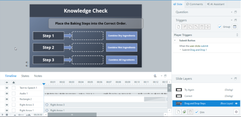
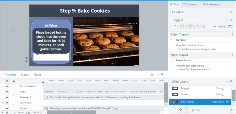
Knowledge Checks
Use of Formative Evaluation in Instructional Design
As an instructional designer, I primarily use formative evaluation, such as knowledge checks, throughout the learning experience, rather than relying solely on summative assessments at the end. Key reasons and practices include:
Reinforce Learning as It Happens
Integrate knowledge checks at key intervals to help learners actively recall and apply new information.
Promote long-term retention through spaced reinforcement.
Provide Immediate Feedback
Offer real-time corrective feedback to address misunderstandings before they become learning gaps.
Help learners build confidence by confirming correct understanding early and often.
Support Self-Paced Learning
Enable learners to monitor their own progress and revisit content as needed.
Encourage reflection and deeper engagement with material.
Supports a Variety of Assessment Types
Incorporating multiple formative knowledge checks allows for diverse assessment formats tailored to the specific skills or knowledge being taught.
This variety enhances learner engagement and keeps the instructional experience dynamic and relevant.
While summative evaluations (e.g., final quizzes or assessments) are used when necessary, my focus on formative evaluation ensures that learning is an active, adaptive process rather than a one-time measurement of knowledge.
Principle in Practice:
Course Evaluation
All digital courses should be concluded with a course evaluation by the learners. The nature of this evaluation can vary based on company needs and expectations.
Some potential evaluation questions include, but are not limited too:
Post-Instruction Evaluation Questions (Likert Scale Format):
I feel confident in applying what I learned in this course to real-world situations.
(Strongly Agree / Agree / Disagree / Strongly Disagree)The content was clear, well-organized, and easy to understand.
(Strongly Agree / Agree / Disagree / Strongly Disagree)The visuals (e.g., images, screenshots, layout) effectively supported my learning.
(Strongly Agree / Agree / Disagree / Strongly Disagree)The course was accessible and easy to navigate (e.g., captions, readable text, clear interface).
(Strongly Agree / Agree / Disagree / Strongly Disagree)The overall eLearning experience met my expectations.
(Strongly Agree / Agree / Disagree / Strongly Disagree)
Articulate 360 Design Sample
*Please note that this eLearning was designed for LMS use and this video serves as a style sample only. Thus the navigation and interactive features will not be functional in the current format.